Southwest Rapid Rewards®
Restructure and reinvent the loyalty program website for Southwest Rapid Rewards®.
When
Summer 2017
Auditing
Benchmarking
Wireframes
UX Design
UI Design
Prototype
Present
Design is currently in user testing led by Southwest’s UX team.
Why
While interning on the UX team at Southwest, I was challenged to reinvent the Southwest stand along page for their rewards program, Rapid Rewards®. The current site is difficult to navigate and hides important information. Using user data from the current Rapid Rewards® site, I reframed and reprioritized content. The goal of the new site was to simplify navigation, streamline content, increase user enrollment and use, and fit with Southwest’s new brand, vision, and partner sites.

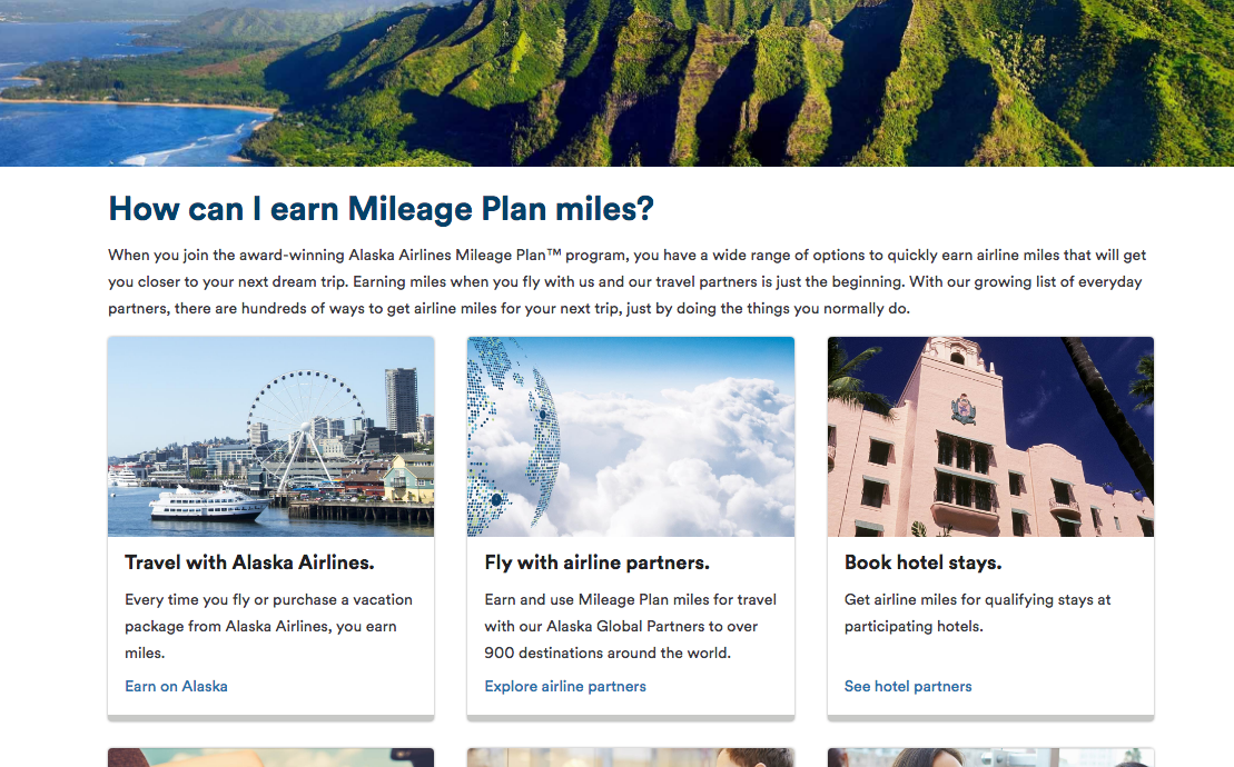
The site’s complicated navigation hid important information. User data confirmed that pages several clicks deep did not get visited a significant amount.
Current Navigation
User data indicated a major drop off in visits for pages deeper than the main navigation. In addition, the sticky menu didn’t allow users to get back to Southwest’s main site.
How
I interviewed stakeholders to understand the goals of the new site. In addition, I reviewed competitor rewards programs and evaluated pros and cons of each. Then, I went through the stages of design to accomplish those goals.
Goals
Reward
Increase New Member Enrollment
Quick and easy process to enroll in Rapid Rewards® or Rapid Rewards® Credit Card
Emphasized benefits of enrolling
Simplicity
Increase Recurring and Frequent Customer Engagement
‘Point Center’ that allows customers to quickly view points and how they can be used
Emphasized promotions and ways to earn and utilize points
Answers to all questions about the program
Heart
Elevate the Southwest Brand and Core Values
Design and aesthetics upholds new vision and branding
User flow is natural and guides customer
Tone is friendly and approachable
Competitors
No competitors had both a clear explanation and navigation of their rewards program. The new design should have a conversational tone AND a clear navigation.
What
A website with
A collapsible header that allows users to jump to each section of the page while keeping all points of navigation available.
Page titles and content made of recognizable terms instead of internal jargon.
Interactive content that better explains the intricacies of the program instead of walls of numbers.


